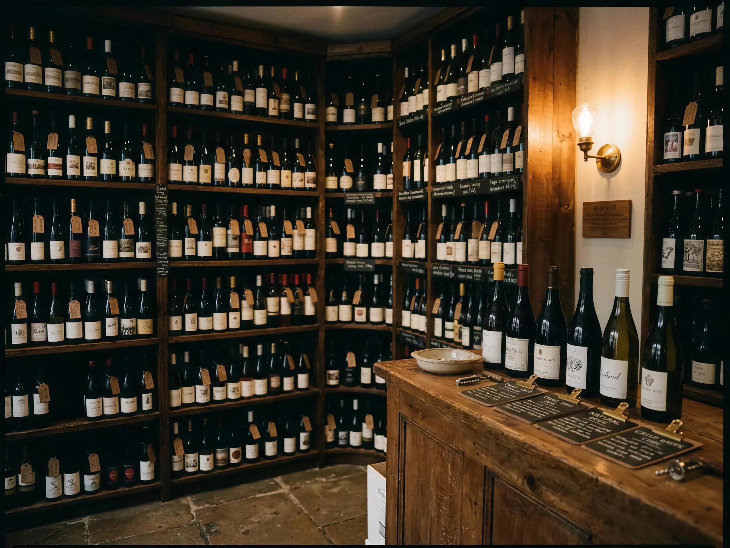
A long list is not a catalogue
An independent wine shop with two hundred lines has more range than most supermarkets show you, and it is the entire reason to shop there. It is also completely unusable as a web page if you present it the way most shops do, which is a long scrolling list or a grid of identical bottle photographs.
The customer arriving on that page has one of about four questions. Something red under fifteen pounds. Something for a person who likes Malbec. Something orange, because they read about it. Something for a fish pie. None of those is answered by scrolling.
The other failure is subtler. Small shops often hide the list entirely, on the grounds that the advice is the product and the advice happens in person. That is true in the shop and useless at nine at night when somebody is deciding whether to visit you tomorrow.
What I built instead
The full list, filterable, with a live count so you always know how much you are looking at. Colour, style, country, price. The filters combine, and the number updates as you change them.
The shop's knowledge sits alongside it rather than being replaced by it: how they buy, what a Thursday tasting is, and why a particular bottle is on the shelf.
A live count, always visible
Two hundred and six results, then thirty one, then four. It tells the customer whether to keep filtering or to stop, and it is the single cheapest way to make a large list feel manageable.
A real empty state
When the filters return nothing, the page says so and offers a way back rather than showing a blank area. Most filterable lists on small sites simply render nothing, and the customer assumes the site is broken.
Filters that combine rather than replace
Red and under fifteen pounds and Spanish, all at once. Single select filters look tidier and answer almost none of the questions people actually have.
Written notes, not scores
A line about what a bottle is actually like beats a number out of a hundred, and it is the thing a supermarket cannot copy. It is also the shop's voice, which is the reason to buy from them.
Tastings given their own place on the page
A recurring event is the most reliable way an independent turns a browser into a regular, and burying it in a news feed wastes it.
No basket, deliberately
This sample is built to get somebody into the shop, not to compete with online wine retail on delivery. Adding a checkout would have made it a worse version of a thing it cannot win at.
Keeping the list current is the whole job
A wine list changes constantly, and a website showing bottles that sold out three weeks ago is worse than no list, because someone has now made a journey for nothing. This is only worth building if updating the list is genuinely quick, which means it needs to be about as easy as writing a shelf label. If maintaining it would fall to the owner at eleven at night after cashing up, the honest recommendation is a smaller curated selection of twenty bottles that changes monthly, not a full inventory that rots.
See it working
The sample is live and fully usable. Put a registration in, add things to a basket, go through the checkout. Nothing charges you and nothing is sent.