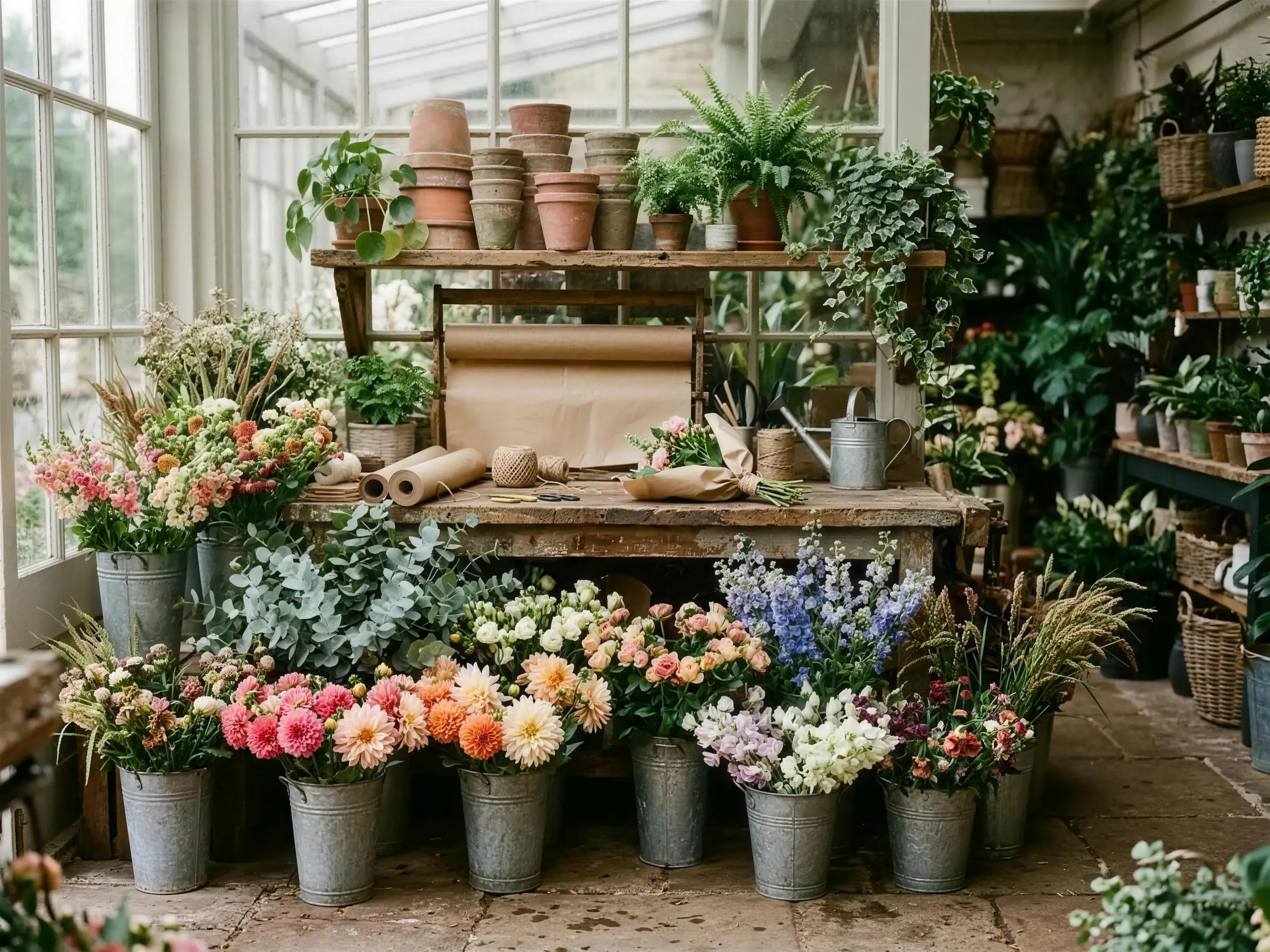
A shop window that most customers never walk past
A florist on a high street sells a large amount of stock to people who were walking by, saw something in the window, and came in. It is the most effective piece of marketing the business has and it only works within about thirty feet of the door.
The website is supposed to be the version of that window which works from anywhere, and usually it is not. The images are small, or slow, or there are twelve of them in a grid with no way to look properly at one, or the whole gallery is on a separate page nobody reaches.
There is a second problem stacked on the first. When somebody does want to enquire, they are faced with an empty box and asked to describe flowers. Most people cannot. They know it should feel a bit wild, they know roughly what they want to spend, and they know it is for their mum's birthday. Asking them to write a paragraph is asking them to do a job they are not equipped for, and a lot of them just close the tab.
What I built instead
A gallery that behaves like one. Images open properly, you can move between them, and the whole thing is built to load fast enough that nobody gives up before the first picture appears.
Then an enquiry that asks six short questions using chips rather than free text. What is it for, what feeling, what palette, roughly what budget, when, and where. Tap through it in under a minute.
Chips instead of a blank text field
Choosing between a few named options is a fundamentally easier task than describing flowers in your own words. The florist gets more usable information and the customer gets a form they can finish.
A budget chip, not a budget box
Asking for a number invites people to lowball or to abandon. Offering ranges makes the question feel normal and gets a usable answer from almost everyone.
The gallery opens in place
No navigation away, no new tab, no scroll position lost. Someone browsing images is in exactly the state you want them in and every interruption costs you some of them.
Images sized properly, and lazy loaded
Every photograph on the page is compressed and only fetched when it is about to be seen. A florist's site is almost entirely images, so this is not housekeeping, it is the difference between the site working on a phone signal and not.
Three services, described in one line each
Bunches, weddings, standing orders. A florist who lists eleven services reads as a florist who does none of them particularly, and standing orders are the quietly profitable one worth naming.
What happens next, spelled out under the form
When you will hear back and what the reply will contain. Enquiry forms that vanish into silence are the most common reason a customer rings a competitor an hour later.
This one lives or dies on photography I did not take
Every image in this sample was generated for it, and on a real build it would be the florist's own work or a proper shoot. That is not a technicality. A site built to showcase photography is only as good as the photographs, and the single highest return thing most florists could do is spend a few hundred pounds on someone who can shoot flowers properly. A beautifully built gallery full of phone snaps taken under shop strip lighting will underperform a plain page with excellent images every time.
See it working
The sample is live and fully usable. Put a registration in, add things to a basket, go through the checkout. Nothing charges you and nothing is sent.